mono
Mono is a series of
single-talk-lectures that are held between ISType conferences
Upcoming Seminar
Jean-Baptiste Levée
Past Seminars
Matthew Carter
Mary Ann Bolger & Clare Bell
Jonathan Barnbrook
Jérôme Knebusch
Jean-Baptiste
Levée
February 22, 2018, Thursday 19:00
SALT Galata
Of curvatures, straight lines and light: when is type not type?

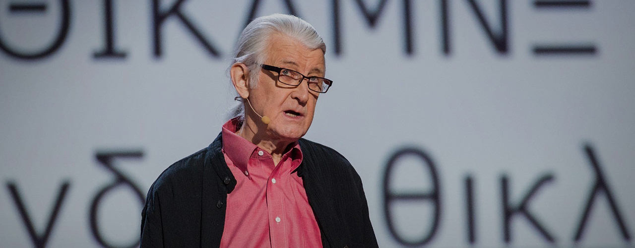
That is the question, among some others, that one will try to answer during a presentation that talks, breathes and lives for type without displaying much letterforms. Jean-Baptiste Levée will evoke the fundamental notions of typeface design, such as rythm, harmony and light. He will encompass the essential but barely documented questions that animate the practice of contemporary type design, with the help of parallels traced with engineering, mathematics, conceptual art, and endurance sports.

Jean-Baptiste Levée works methodically in a process where history and technology are approached altogether within the nuances of artistry. He manufactures functional, yet versatile digital platforms for designers to build upon.

Levée has designed over a hundred typefaces for industry, moving pictures, fashion and media. His work has won multiple awards and has been shown internationally in group and solo shows. It is featured in the permanent collections of the French national library (BnF), the Decorative Arts museum of Paris and the National Center of arts (Cnap); of the Newberry Library in Chicago, and several printing museums in Europe. He is a board member at ATypI (Association Typographique Internationale), honorary counselor of the Letterform Archive (San Francisco), and consults as a design expert advisor for the French Public Investment Bank (BPI) where he is contributing to the spread of design in innovative businesses. He is a partner in tech startup Prototypo. Levée teaches typeface design at the Amiens school of Arts & Design and at the University of Corte.

productiontype.com >>
Matthew
Carter
May 28, 2016, Saturday 18:00
SALT Galata
sponsored by

Untypical Types

Much of my work over the years has been devoted to text types with an emphasis on legibility. Text types, however, make rather dry and repetitive subjects for slide talks—only the most diehard typophile wants to look at endless slides of 9-point type.

For this talk I have chosen a few designs that are perhaps less typical of my work in general but which do have a more visual narrative in their backstory, in other words they are designs that make more interesting slides. They also illustrate the variety of ways by which new typefaces can come into existence.

The first is Mantinia, a titling face inspired by the lettering in the paintings of the Italian Renaissance artist Andrea Mantegna. Mantinia’s letterforms were also influenced by inscriptions on buildings and gravestones in and around Boston. Walker, designed for the identity of the Walker Art Center, tries to represent the Walker’s motto: “Open to interpretation.” The letterforms can be modified by the user depending on context.

A typeface commissioned for Yale University has two versions, one for print and the web, the other for signs on campus. The design derives from an ancient book in the library at Yale.

Van Lanen is a wood type. The Hamilton Wood Type Museum commissioned it for printing letterpress posters. It comes in two forms, positive and negative.

Mary Ann
Bolger,
Clare Bell
December 19, 2014, Friday 19:00
SALT Galata
Divided by a Common Typeface

The Irish language is a fundamental term in the discourse of Irish national identity, yet its visual manifestation is often over looked. Through the course of the evening, Clare and Mary Ann will explore how the visual representation of one language can be ‘translated’ into another. They look at how typography enhances the symbolic utility of language as a conduit for myth, and for the demarcation of religious and cultural difference in both Northern Ireland and the Republic of Ireland.

Mary Ann Bolger lectures in design history and critical theory at the Dublin Institute of Technology (DIT). With Clare Bell, she is Ireland’s ATypI country delegate. Together they organized the Dublin 2010 ATypI conference and coordinate Typography Ireland. Mary Ann holds an M.A. from the Royal College of Art, where she is completing a PhD on post-war Irish graphic design and typography. She is the author of a book on Irish graphic design, Design Factory: On the Edge of Europe (Amsterdam: BIS, 2009).

Clare Bell lectures in Visual Communication (School of Art, Design & Printing, DIT). She received her B.A. (Graphic Design) at Central St Martins and worked for a number of years as an editorial designer on The Guardian newspaper. She is co-coordinator of Typography Ireland at the Graduate School of Creative Arts and Media (GradCAM) with Mary Ann Bolger, board member of Association Typographique Internationale (ATypI) and a regular assessor on the ISTD annual student assessment awards. A practicing designer, recent clients include IMRAM Irish Language Festival, In Print journal, NCAD/GradCAM (ObjectMatters: Making1916), ATypI (2010), The Joinery Gallery and Soundsdoable radio production (Culturefile, Soundstories).

Jonathan
Barnbrook
May 2, 2014, Friday 19:00
SALT Galata
What You Want Is Not What You Need

The talk is a journey through 20 years of personal and professional projects. The subjects covered range from the trouble caused naming a typeface after a serial killer, to the work for the designs on the secretly recorded album for David Bowie ‘The Next Day’. Barnbrook will also be showing his anti-advertising work and wide ranging political projects. The talk does not aim to explain ‘how’ but very much why, in a wider context of all society not just the world of graphic design.

Jonathan Barnbrook is one of the most well-known graphic designers in Britain. Rather than becoming a purely commercial designer he has chosen to work with a mixture of cultural institutions, activist groups and charities as well as completing a steady stream of personal posters. He is also know for his collaborations with Adbusters, Damien Hirst, his work for David Bowie,. His ubiquitous fonts such as ‘Mason’ and ‘Exocet’ are released through Emigre and his font company Virusfonts. His contribution to graphic design was recognised by a major exhibition at the Design Museum, London in 2007.

barnbrook.net >> virusfonts.com >>
Jérôme
Knebusch
December 19, 2014, Friday 19:00
SALT Galata
From Handwriting to Type Design

Instant is a type family with no common distribution of roman, italic and their respective heavier or lighter fonts. Instead, a ‘diagonal’ has been adopted: from thin, informal, quick handwritten letters to stable, black typographic shapes. Each of the five styles correspond to a specific stroke speed and weight: Vivid, Quick, Regular, Slow, Heavy. Started as research project in 2005 at National Atelier for Typographic Research [ANRT, Atelier National de Recherche Typographique] France, hommage to the poet, painter and writer Henri Michaux (1899–1984), it questions type family consistency and the relation and usage of roman, italic and bold faces. The talk will go back to it’s genesis and drawing process as well as discussing type classification and fundamental aspects of letter constructions.

Jérôme Knebusch works in visual art, graphic design, editorial design, typography and type design. He teaches graphic and type design at the Lorraine School of Fine Arts, Metz, and is regulary visiting the post-graduate National Atelier for Typographic Research [ANRT], Nancy, both in France. He lives and works in Frankfurt am Main, Germany. Instant, published by BAT Foundry Paris, was selected favorite typefaces of 2012 by Typographica and best ten fonts of 2012 by Fontwerk.

jeromeknebusch.net >> anrt-nancy.fr >> atelier design graphique & typographie >> batfoundry.com >>